* For Apple Watch.
Another day, another awesome release from Traitify! On Wednesday I shared the news of Hyundai's Fan Quiz going live, and today I'm back with another incredible announcement.
I won't lie — we have some full-blown Apple fanboys here at Traitify, so when Apple Watch was announced, we lost our minds. We couldn't wait to get our hands on the new device. Alarms were set at random hours to ensure a successful pre-order, and after a terrifying attempt to confirm an Apple Watch, one of our team members found himself with two of the new-fangled wearables on the way to him. And being the creative and wily people that we are, a challenged was issued.
The first person to make our assessments accessible on Apple Watch, would get the extra device. One of our developers, Tom Prats, was eager to accept the challenge and started work on an app.
We have now released Tom's app.

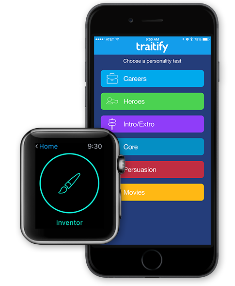
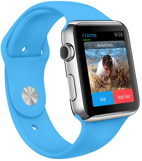
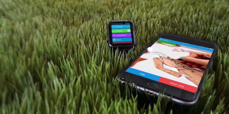
The Traitify Demo App accomplishes a number of things in one simple and succinct application. To start, we now have a native way to try our assessment in a mobile environment. Open up the app on your iPhone and experience how engaging it is to tap "Me" and "Not Me" from a native application versus running off of a browser view. Next, we have an award-winning feature — enable the app on your Apple Watch, and you can breeze through the assessments with a casual tap on your wrist. It might be a novelty, but we can only imagine the incredibly brilliant ways that the assessment can be tied to other applications in the future.
The final achievement of the Traitify Demo App is the fact that it was built entirely using our own Personality API. We're big fans of practicing what you preach, and Tom's dedication presented is only bested by his unwavering love of Taylor Swift.

But in all seriousness, the app is a great demonstration of what can be accomplished in only a short time using our API. We're proud of our API, but sometimes even we are little surprised by just how accessible it is.
If you've gotten this far and haven't check out the app, search ‘Traitify' in the App Store on your iOS device, or click here to view our App Store web view.
Finally, since some of you might be wondering exactly how Tom Prats was able to craft this application, and get assessments working on Apple Watch, we decided to ask him. It's a little technical, but definitely informative for anyone looking to dive into Apple Watch development.
Scott Tremper: What exactly did you create?
Tom Prats: Well, technically I built an iPhone App, WatchKit App, WatchKit Extension, and a framework. At first I thought I'd be able to get away with just building a simple app exclusively for Apple Watch. It turns out that there's a fair bit involved with it. Although it can be nearly completely independent, Apple requires an iPhone App alongside your WatchKit App. It also requires the WatchKit Extension to run all of the controller logic within the WatchKit App. Lastly, I built a simple framework to encapsulate and share data between the WatchKit Extension and iPhone App.
ST: So the data reflected on someones iPhone App is the same as they see on their Apple Watch?
TP: I worked with Core Data to manipulate and store data on the iPhone. In order to use the same models, a framework was required. This just meant I could extract models such as "Personality" and "Slide" from being in the iPhone App, to being accessible from the iPhone and WatchKit Apps. Using a "Shared App Group" will make the data accessible from any app you add to the group. This was incredibly convenient, because all of my database interactions could be the same in both apps. If only this were the case with layouts or controllers.
ST: I take if you encountered a bit of a hurdle at this point?
TP: The iPhone recently started using "Auto Layout". This works by adding "constraints" to each element (or between elements) on the Interface Builder. This helps when building for the iPhone because there are a million phone sizes that should probably look pretty similar. With constraints, you simply position or size elements relative to one another. You can see this with how the top of the caption and image are pinned together. You can do this for every single element through the interface, and then it will look great on every screen size! After learning that, it's actually very simple, and exciting, to make new views for the iPhone.
But then you jump into the watch and think, "Hey, there aren't very many elements to play with…"
And then notice that things are positioned pretty differently.
However, even though it's more restricted than building an iPhone view, it actually is simpler in the end. Elements are simply aligned to the top, middle, bottom (vertically) or left, center, right (horizontally). An element that gives you a little more freedom is the "Group" element. This gives you the opportunity to align a group of buttons ("Me" and "Not Me") to the bottom of the Apple Watch in a group, and then inside the group the buttons can be aligned to the left ("Me") and right ("Not Me").
ST: You mentioned that controllers also provided a bit of a learning curve?
TP: When you start building an iPhone app, you first have to think about what kind of "View Controller" you want to use. Your options are Tab Bar, Navigation, or Split View. Many apps mix and match a few of them. Twitter uses a tab bar, with each tab having its own navigation controller. I specifically chose a Navigation Controller, starting with a Table View, that navigated you into whichever row you clicked. View Controllers come with a variety of very helpful methods. With a Navigation Controller, you can very easily push or pop views depending on the user's interactions. An especially helpful option was to pass whether or not to animate the push or pop.
When a user finishes an assessment, they are popped out of that view (without animation) and then pushed into the results view. This allows them to hop right back to the Table View when they back out of the results. When building the app for Apple Watch, I was hoping to be able to do the exact same thing, but instead found a completely different set of methods when working with the "WKInterfaceController", the equivalent to a View Controller for Apple Watch. Interestingly, the WKInterfaceController is actually running on your phone, not your Watch. In the Traitify WatchKit App, we use a hierarchical navigational style, giving us access to similar push and pop methods that the iPhone App has. With hierarchical navigation, we don't have the ability to turn off the animation. If we continue pushing views onto our hierarchical stack, we will have to pop up through each controller, which can be seen if you keep retaking the assessment from the results page. Segues can also be used to trigger navigation in both the watch and the phone, although limited in WatchKit.
ST: I imagine you're anxiously awaiting more updates to WatchKit from Apple?
TP: While the WatchKit SDK lacks a lot of what the iPhone can do, it is still relatively easy to use. Duplicating some of the functionality from an iPhone App into an Apple Watch App can be done with relative ease. That being said, there is some missing functionality that will hopefully be added to the WatchKit SDK when Apple releases a major update later in 2015.
ST: You really knocked it out of the park with this first iteration of the Traitify Demo App. What's next for it?
TP: What I created was a great starting point to create ideas of how to utilize Traitify's API within an iOS and Apple Watch application. I‘m planning to add additional functionality in the near future, including a "Glance Interface", push notifications, and other features such as location services.
ST: You realize that I barely understood most of what you just said?
TP: Yup.
ST: Cool.
Huge thanks to Tom for taking the time to fill us in on his journey with WatchKit.
Until next time, please download our app.


